






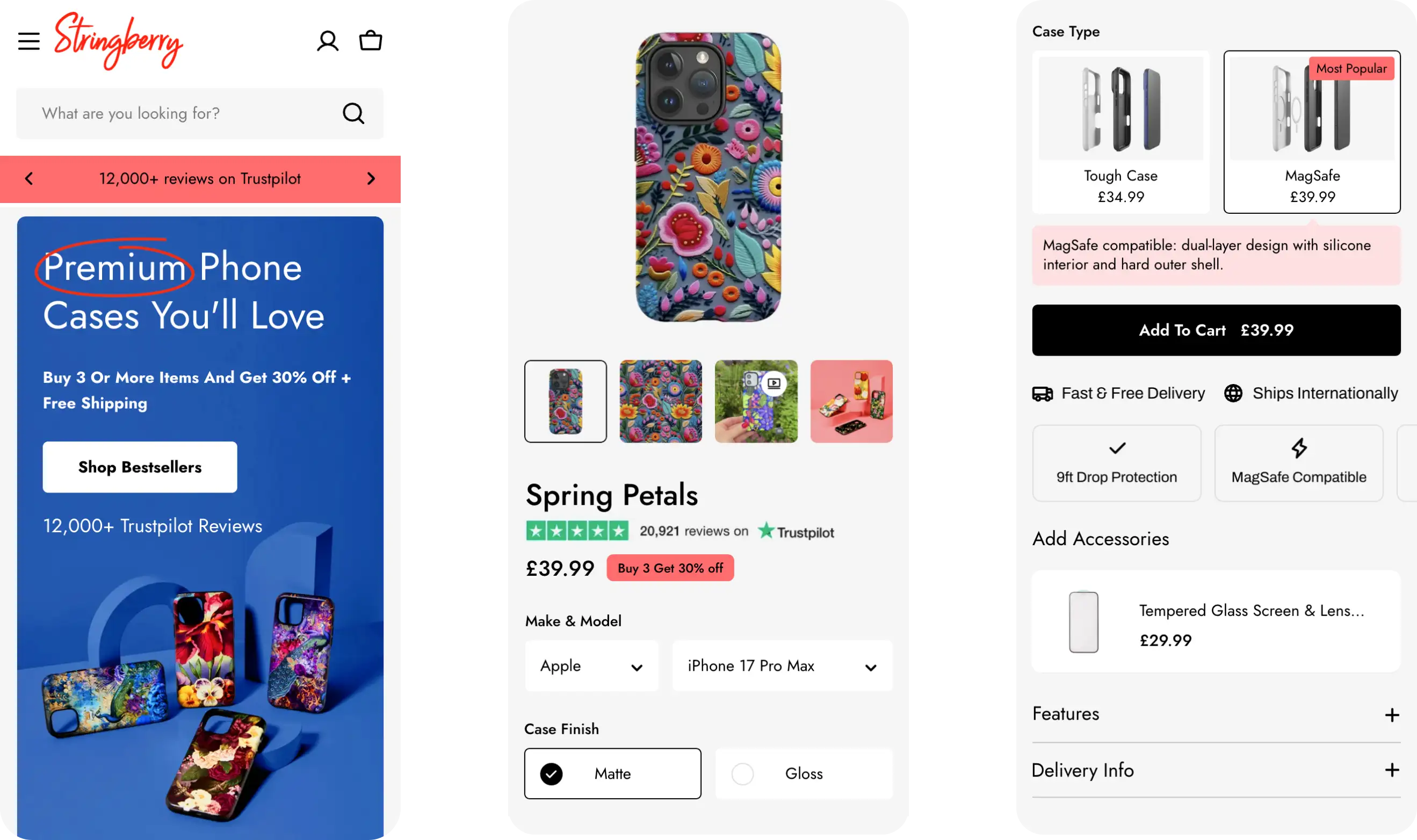
A better shopping experience, built to convert
Modernising Stringberry wasn't just about a fresh design. It was about making thousands of products easier to discover, navigate and buy.
Stringberry is a British brand specialising in artist-designed phone cases and accessories, with an extensive catalogue spanning thousands of products and designs. Already established on Shopify, Stringberry partnered with Inspira to modernise its storefront, making it easier for customers to discover products, select the right options and complete their purchases.
What began as a conversion rate optimisation project evolved into a wider storefront redevelopment, combining a fresh design, streamlined navigation, improved product pages and extensive product data restructuring.
The brief
Stringberry's existing storefront had become increasingly difficult to navigate, with an overcrowded menu and a complex product catalogue spanning numerous phone manufacturers, models and case types.
The goal was to simplify the shopping experience and improve conversion rates, while giving the Stringberry team a more flexible storefront to manage as its product range continued to grow.
The results were seen immediately
The impact was evident in the initial post-launch data. Comparing the first nine days following launch with the nine days before, Stringberry recorded:
- A 23% increase in overall conversion rate, rising to 25% for mobile visitors.
- An 87% increase in conversion rate among visitors landing directly on product pages, rising to 99% for mobile visitors.
These early results were particularly encouraging. With almost 80% of Stringberry's traffic landing directly on product pages, the biggest improvements were seen in the very journeys we'd prioritised throughout the project.
Understanding where customers were struggling
The data didn't just reveal that customers were struggling to convert. It showed us where to focus our efforts.
Before recommending a major redevelopment, we wanted to understand how customers were using Stringberry's existing Shopify store and where improvements could have the greatest impact.
Our approach to eCommerce strategy starts with understanding the challenges, identifying opportunities and prioritising the changes most likely to make a difference.
Our initial CRO audit analysed more than 626,000 shopping sessions, reviewing traffic sources, device performance and where customers were dropping out of the purchasing journey. The findings highlighted three key opportunities:
- Product pages were the priority. 78% of visitors landed directly on product pages, making these the first impression of Stringberry for most potential customers.
- Desktop visitors were struggling to convert. Visitors landing on product pages were 92% less likely to complete a purchase on desktop than on mobile.
- Navigation was unnecessarily complicated. With 22 menu items and an extensive product catalogue, customers faced too many choices when trying to find the products they wanted.
The data showed that the biggest drop-off occurred before customers added products to their baskets, helping us focus on improving the product page rather than checkout.
One of our initial hypotheses was that the oversized sticky header was taking up valuable screen space and pushing important product information further down the page. We saw this as a quick opportunity to test our assumptions before committing to wider changes.
Removing the sticky header delivered an 8% uplift in add-to-cart rate and a 4% increase in conversion, helping validate our thinking and reinforcing the opportunity to rethink the site's navigation.
Making a complex catalogue easier to navigate
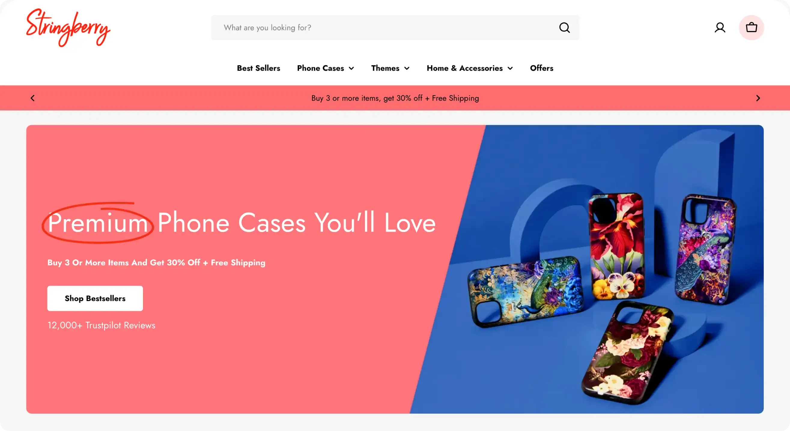
The goal wasn't simply to reduce the number of menu links. It was to put phone cases back at the heart of the shopping experience, while making it easier for customers to discover the wider catalogue.
The oversized header was just one part of the problem. Stringberry's navigation had grown to include 22 menu items, making it increasingly difficult for customers to find their way around an extensive product catalogue. We took the opportunity to rethink the entire site structure, bringing the navigation back to the heart of Stringberry's business: phone cases.
From there, we considered how customers actually browse and discover products, creating clearer shopping journeys that allowed them to:
- Shop by device, helping customers find cases compatible with their iPhone, Samsung or Google phone.
- Explore by artist or aesthetic, making Stringberry's extensive collection of artwork and designs easier to discover.
- Browse accessories, with clearer categories for complementary products.
Improving product discovery beyond the main menu
Restructuring the navigation also meant rethinking how products were organised throughout the store. We rebuilt the collection structure, introduced more relevant filtering options and created clearer routes into the catalogue.
SEO was also an important consideration, with new collection URLs and redirects planned to support the transition without unnecessarily disrupting existing organic visibility.
The result was a more focused shopping experience that made thousands of products easier to discover, whether customers knew exactly what they wanted or were simply browsing for inspiration.
Rethinking the product page experience
With thousands of designs across hundreds of product combinations, the challenge wasn't simply presenting more choice. It was making the right choice easier.
With almost 80% of traffic landing directly on product pages, improving the experience was a major priority. Our conversion and UX optimisation work focused on making it easier for customers to choose the right product and purchase with confidence.
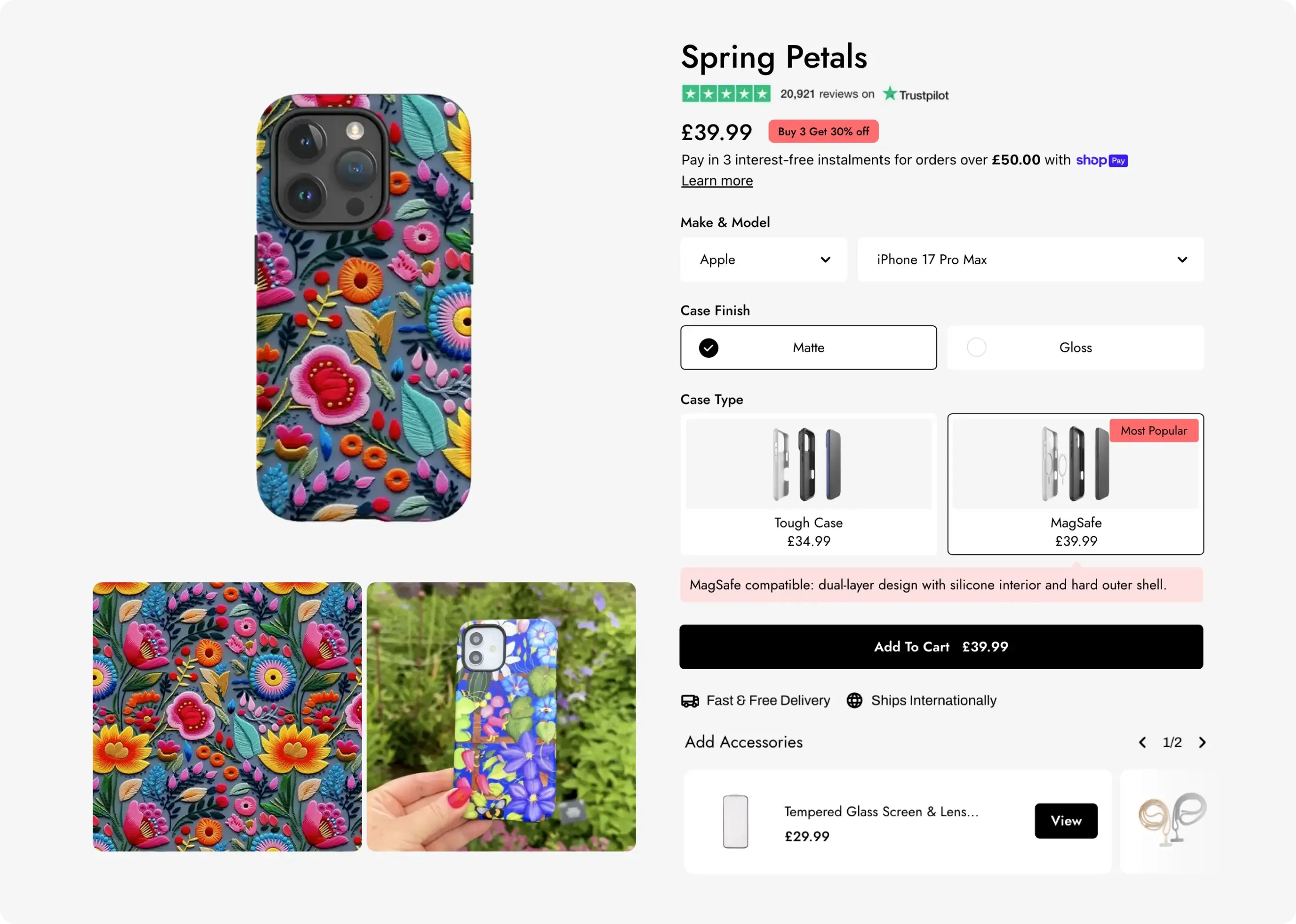
Stringberry's extensive catalogue presented a particular challenge. The same design could be available across dozens of phone models, different manufacturers and multiple case types. Customers needed to find the right combination without being overwhelmed by options. We redesigned the product page experience to make choosing and purchasing a phone case more straightforward, focusing on several key improvements:
- A cleaner, more reassuring product page, bringing pricing, purchasing options and essential product information into focus, while positioning reviews, delivery details and trust signals where customers need them most.
- Simplified product selection, making it easier for customers to switch between phone manufacturers, models and case types while keeping their chosen design, without having to return to collection pages.
- A smarter product image gallery, showing only images relevant to the selected phone model alongside a few lifestyle shots, rather than overwhelming customers with all the images from hundreds of variants.
Connecting products beyond Shopify's standard variants
Stringberry's phone cases required four product options: Brand, Model, Case Type and Case Finish. With Shopify traditionally supporting only three options per product, we needed a different approach. We created custom sibling-product functionality that connected separate Shopify products, allowing customers to switch between configurations while keeping their chosen design.
This created a seamless product selection experience without fundamentally changing how Stringberry's extensive catalogue was managed.


Modernising the data behind 17,500 products
A modern storefront is only as good as the product data behind it. By restructuring the catalogue, we made thousands of products easier to discover, manage and grow.
Redesigning the storefront was only part of the challenge. To make the new navigation, product filtering and selection experience work effectively, we also needed to rethink how Stringberry's product data was structured. With approximately 17,500 products in scope, this was a substantial undertaking. Existing product information needed to be organised into a consistent structure that Shopify could use to power the new shopping experience.
We introduced new Shopify metafields to organise products by device compatibility, case type, artist, aesthetic and accessory category. These provided the foundations for three important improvements:
- Smarter smart collections, automatically grouping products by device compatibility, artist, aesthetic and product type, making it easier to build and maintain collections.
- More accurate filtering, allowing customers to narrow down thousands of products by phone model, case type or design preference to find exactly what they're looking for.
- Connected product options, establishing the relationships between separate Shopify products needed to power the custom sibling-product functionality.
Crucially, we planned the changes around Stringberry's existing product data, preserving the information and functionality the live store relied upon. It's the kind of work customers rarely see, but it's essential to making a complex ecommerce store easier to navigate, maintain and grow.
By improving the foundations of the catalogue, we weren't just supporting the new storefront. We were making it easier for Stringberry to introduce new products and collections as the business evolved.

The impact on conversion
“The site is now easier to navigate, the user experience is better, and the whole thing feels much more streamlined. It was clear throughout that the team understood the problems we faced and were focused on solving them.”
Richard Booth, Stringberry
The impact of Stringberry's Shopify modernisation was evident almost immediately. Comparing the first nine days following launch with the nine days before, the store recorded significant improvements in conversion rates, particularly among customers landing directly on product pages.
- 23% increase in overall conversion rate, rising to 25% for mobile visitors.
- 87% increase in conversion rate for visitors landing directly on product pages, rising to 99% on mobile.
These early results were particularly encouraging given the findings of our original CRO audit. With almost 80% of visitors arriving directly on product pages, the improvements were strongest in the shopping journeys we'd identified as a priority.
What began as a conversion rate optimisation project evolved into a much wider Shopify store modernisation. By combining customer behaviour insights with thoughtful UX design, custom Shopify development and extensive product data improvements, we helped Stringberry create a shopping experience that better reflects its products and the way its customers shop.
Could your Shopify store be working harder?
You don't always need a new platform to create a better shopping experience. From identifying conversion barriers to modernising complex storefronts, we help established Shopify merchants understand what's holding them back and make the right improvements.
Explore Shopify Store Modernisation
Frequently asked questions
Can you modernise a Shopify store without disrupting day-to-day operations?
Yes. Shopify stores can be redesigned and redeveloped while the existing storefront continues to operate. For Stringberry, we developed the new storefront alongside the live store, carefully planning changes to product data to preserve existing functionality and avoid interfering with ongoing operations.
This allowed Stringberry to continue trading throughout the redevelopment, with the new experience introduced at launch.
How do you identify what's preventing customers from converting on Shopify?
For Stringberry, we started with a CRO audit of more than 626,000 shopping sessions to understand where customers were struggling. The research revealed that almost 80% of visitors landed directly on product pages, with particularly low add-to-cart rates on desktop. This helped us prioritise changes to the product page experience, navigation and purchasing journey.
An initial experiment removing the oversized sticky header delivered an 8% increase in add-to-cart rate, helping validate our approach before the wider redevelopment.
How do you manage complex product options in Shopify?
Shopify traditionally supports three options per product, which can be restrictive for more complex catalogues. Stringberry needed four: Brand, Model, Case Type and Case Finish.
We developed custom sibling-product functionality to connect related products, allowing customers to switch between configurations while maintaining a seamless shopping experience.
Why is product data important when redesigning a Shopify store?
Well-structured product data powers everything from collection organisation and product filtering to compatibility information and related products.
For Stringberry, modernising the data across approximately 17,500 products was essential to supporting the new navigation, smarter collections and connected product options.