



Optimisation
Your Shopify store is generating sales, your marketing is bringing in traffic, and on the surface, things are working. But could your store be converting more of those visitors into customers?
For established ecommerce brands, improving conversion isn't necessarily about a complete redesign or introducing more functionality. Often, it's about identifying the smaller points of friction that have developed across the customer journey.
The challenge is knowing where to look, what to prioritise and which changes will actually make a difference.
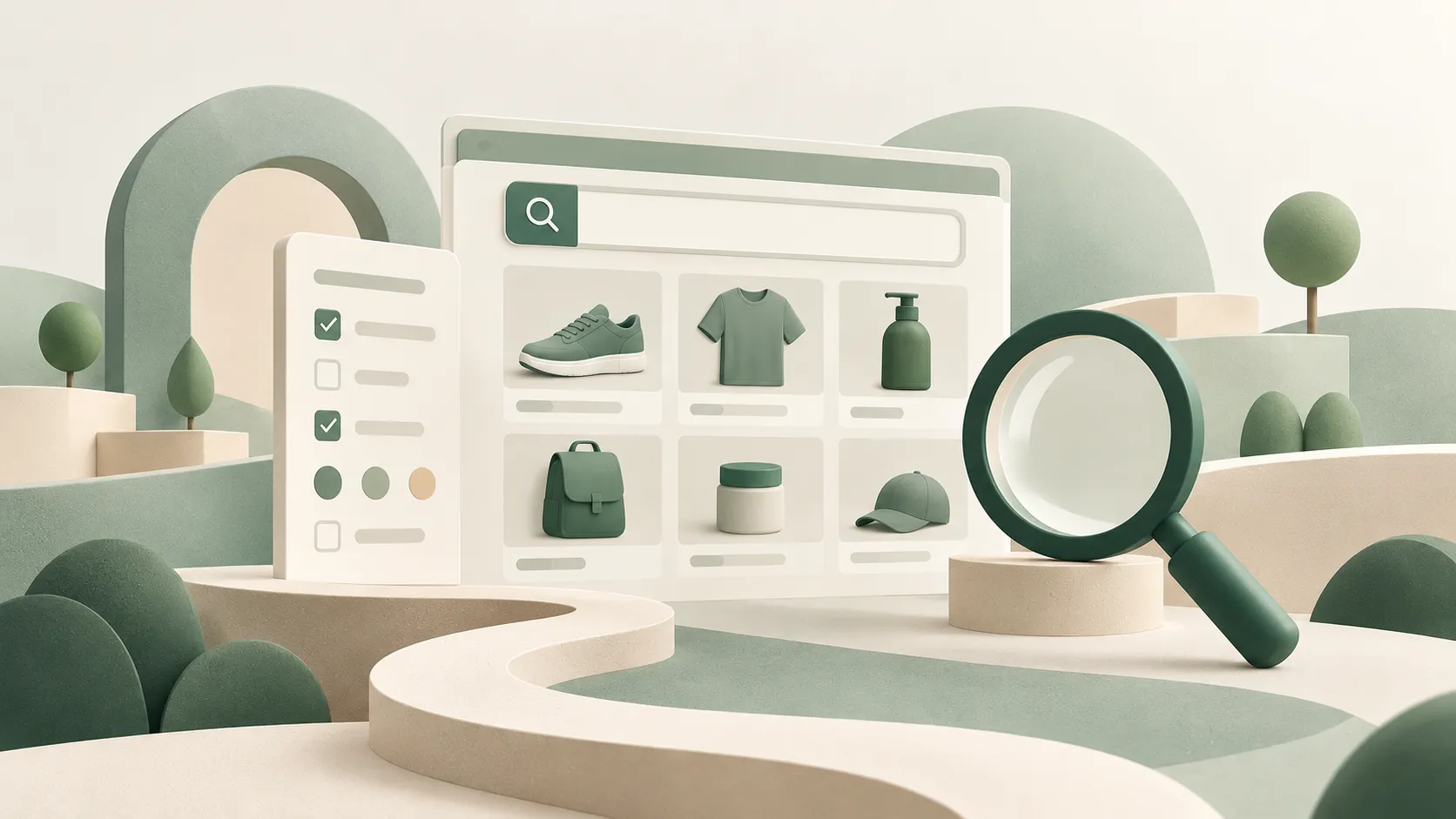
Can customers find what they're looking for?
Good user experience is not about how your store looks. It's about making it easy for customers to find what they came for.
Getting visitors to your Shopify store is one thing. Helping them find the right products is another. As your catalogue grows, navigation and product discovery can become more complicated. Poorly organised collections, confusing navigation and unhelpful filters can all create unnecessary friction. Here are a few ways to identify potential problems:
- Site search: Are customers finding relevant products, or are searches regularly returning no results?
- Collection performance: Are visitors browsing collections but struggling to find products that interest them?
- Customer behaviour: Can heatmaps and session recordings reveal where visitors are struggling?
- Usability testing: Can someone unfamiliar with your store find a particular product quickly and without assistance?
As part of our Conversion & UX Optimisation work, we use these insights to identify and test improvements to navigation, search, filtering and merchandising. The goal isn't simply to make changes, but to understand which improvements will make it easier for customers to find and buy products.
Are your product pages giving customers confidence to buy?
A good product page should answer customers' questions before they need to ask them.
Getting customers to the right product is only half the challenge. Your product pages need to give them the confidence to buy, helping them understand what they're purchasing and whether it's right for them. Here are a few things worth reviewing:
- Product imagery: Do your images show the product clearly, from different angles and in context?
- Product descriptions: Are you answering customers' questions rather than simply listing features?
- Product options: Is it easy to choose the right size, colour or variant?
- Delivery and returns: Are costs, delivery times and returns policies clearly communicated?
- Reviews and social proof: Are genuine customer reviews helping build confidence?
- Finance options: For higher-value purchases, are flexible payment options available and clearly promoted?
Individually, these might seem like small details, but together they can make a significant difference. If customers are regularly viewing products without adding them to their baskets, it's worth investigating why.
A real world example: Symprove
When working with Symprove, we helped introduce a free gift offer designed to encourage customers to commit to a 12-week subscription pack. Working alongside their marketing and design teams, we helped plan, implement and test how the offer was presented within the purchasing journey.
The result was a 9.1% uplift in conversion rate, increasing from 2.88% to 3.14%.
It's a good example of how improving the way an existing offer is communicated and experienced can make a measurable difference, without needing to completely redesign the storefront.
Read how we helped Symprove improve conversion by 9.1%
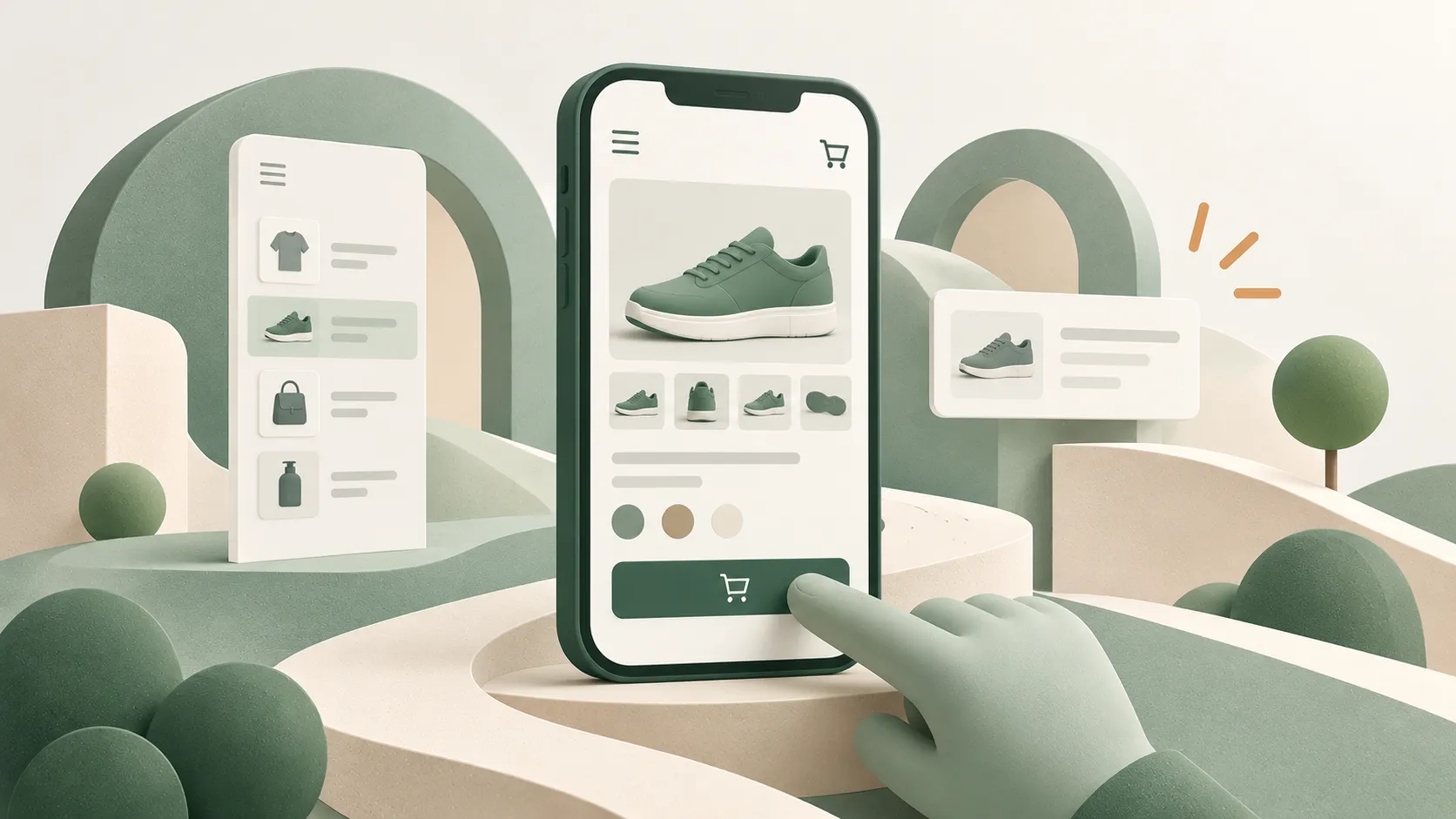
Is your mobile experience as good as you think it is?
Being mobile-friendly isn't the same as being easy to shop on mobile. A responsive design makes your store accessible on smaller screens, but a great mobile experience makes customers buy.
Shopify themes are designed to be responsive, but that doesn't guarantee a good mobile shopping experience. Your store might look great on a phone while still making it difficult for customers to browse and buy. Some common usability issues include:
- Navigation that takes too many taps to find products.
- Product filters that are difficult to use on smaller screens.
- Pop-ups and floating widgets that obscure important content.
- Product galleries that are awkward to swipe through or zoom.
- Variant selectors and add-to-basket buttons that are difficult to interact with.
- Slow-loading pages or layouts that jump around as content loads.
These frustrations are particularly important when visitors are casually browsing. Someone clicking an advert in their social feed has shown a passing interest in your brand, but a poor first impression can be enough to make them move on.
What's happening between add to cart and checkout?
The important thing is understanding where customers are dropping off and whether something in the buying journey is contributing to that decision.
Getting a customer to add a product to their cart is a positive sign. They've shown an interest in buying, but there's still a long way to go before that becomes a completed order. This is often where unexpected costs, confusing information or unnecessary friction can cause customers to reconsider their purchase.
- Cart experience: Are customers being directed straight to checkout, or does your add-to-cart notification leave them stranded on the product page?
- Unexpected delivery costs: Are customers discovering additional charges that weren't clearly communicated earlier?
- Delivery options: Are you offering the flexibility customers expect, including express delivery or collection where appropriate?
- Payment options: Are express payment methods such as Shop Pay, Apple Pay and PayPal available to make checkout easier?
It's also worth remembering that not every abandoned basket represents a lost sale. Some customers are simply comparing prices, checking delivery costs or saving products for later.
Review your Shopify conversion funnel to see how many visitors add products to their basket, reach checkout and complete their purchase. This can help narrow down where further investigation is needed.
A real-world example: RecommerceIT
When working with RecommerceIT, we noticed desktop customers were dropping off after adding products to their cart. It turned out that dismissing a bundle offer left them on the product page, so we tested redirecting them straight to their cart instead.
The results were impressive, with a 31% increase in order completion among desktop customers who added to cart.
This shows how a relatively small UX improvement can make a meaningful difference without requiring a major redesign.
Is your Shopify store becoming unnecessarily complicated?
The goal isn't to have a Shopify store that does everything. It's to have one that makes buying as straightforward as possible.
As your Shopify store evolves, it's natural to add apps, functionality and customisations. But over time, these additions can create unnecessary complexity, slow down your store and make it harder for customers to buy.
- Third-party apps: Are you paying for apps you no longer need or use?
- Site performance: Are slow-loading pages or layout shifts frustrating customers?
- Competing functionality: Are pop-ups, promotions and widgets getting in each other's way?
- Theme customisations: Have years of changes made your store harder to use and maintain?
More functionality doesn't always mean a better shopping experience. Reviewing your apps, theme and performance can uncover opportunities to reduce costs, improve conversion and simplify ongoing maintenance.
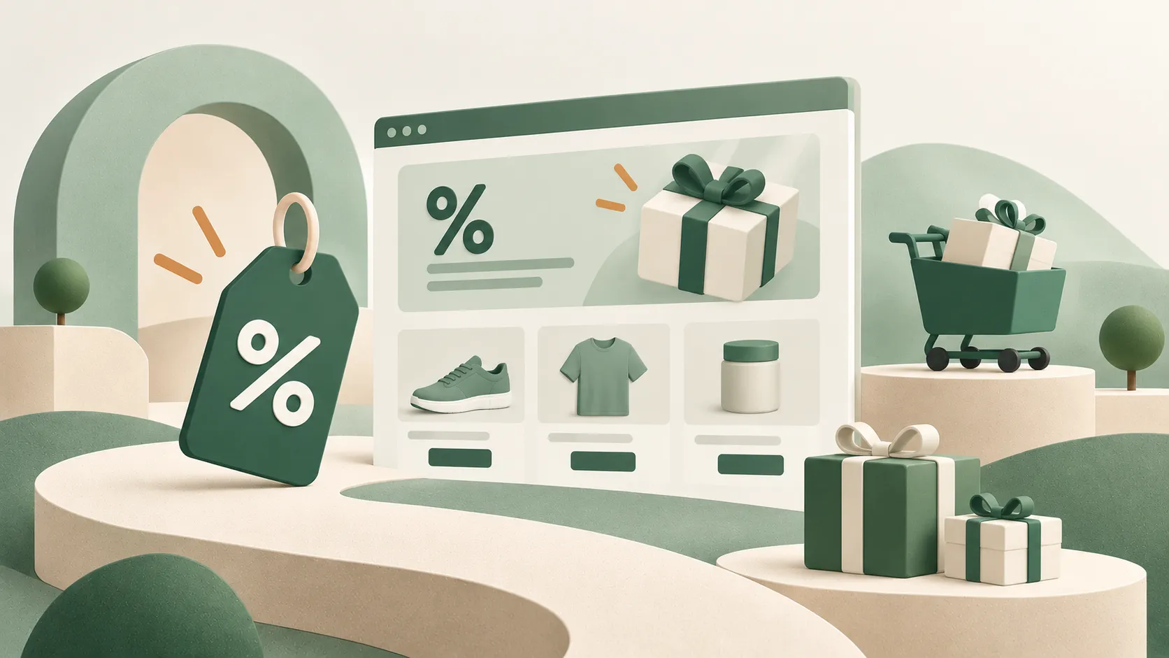
Are you making the most of your promotions and incentives?
Sometimes the opportunity isn't to offer customers a better deal. It's to make the value of your existing offers easier to understand.
Discounts, free delivery and other incentives can encourage customers to buy, but only if they're aware of them. How and when you communicate an offer can make a significant difference to conversion and average order value.
- Promotional messaging: Are discounts and special offers clearly communicated throughout the buying journey?
- Free delivery thresholds: Could a cart progress bar encourage customers to spend a little more to qualify?
- Spend-based incentives: Could relevant product recommendations help customers reach a promotional threshold?
- Product bundles: Could complementary products be grouped together to simplify purchasing and increase order value?
Making your existing promotions more visible and easier to understand can help increase conversion and average order value without offering bigger discounts or sacrificing margin.
Are you using your data to make better decisions?
Good conversion optimisation isn't about making more changes. It's about using evidence to make better decisions about which changes are worth making.
Shopify provides plenty of data about your store's performance, but understanding what to do with it is another challenge. Looking beyond traffic, revenue and overall conversion rates can help identify where you're losing potential sales.
- Conversion funnel: Where are customers dropping off between viewing products, adding to cart and completing checkout?
- Device performance: Are mobile visitors converting at a lower rate than desktop users?
- Landing pages: Are high-traffic pages generating the sales you'd expect?
- Customer behaviour: Can heatmaps and session recordings reveal where customers are struggling?
- A/B testing: Are your changes actually improving conversion, or simply based on assumptions?
Data can highlight potential problems, but it doesn't always explain why they're happening. This is where experience makes a difference. At Inspira, we combine analytics, customer behaviour insights and Shopify expertise to identify opportunities, prioritise improvements and test their impact.
A real-world example: Zatu Games
When reviewing Zatu Games' analytics, we noticed their checkout was under performing. But digging deeper revealed a very different picture: UK customers were converting well, while international customers were abandoning checkout at a much higher rate.
By investigating international shipping costs and duties, we identified a likely reason for the difference.
A good example of why headline figures don't always tell the full story. Sometimes, understanding where the problem really lies is more valuable than rushing to make changes.
Improving conversion starts with a conversation
The challenge is understanding where your biggest opportunities lie and which improvements are worth investing in.
There's no single change guaranteed to improve your Shopify conversion rate. Every store is different, and what works for one brand won't necessarily work for another.
At Inspira, we start with a conversation about how your store is performing and where you feel there's room for improvement. Our Conversion & UX Optimisation workshop then takes a deeper look at customer behaviour, identifies potential barriers to conversion and builds a prioritised plan for improvement.
If you think your Shopify store could be performing better, let's start a conversation.


Frequently asked questions
Do I need to redesign my Shopify store to improve conversions?
Not necessarily. Some of the most valuable improvements come from relatively small changes, such as clearer product information, better navigation or a simpler route to checkout.
A full redesign may be appropriate if your current theme has significant limitations, but it's usually worth identifying and prioritising specific conversion problems before committing to a larger project.
Can Shopify A/B testing improve conversion rates?
A/B testing allows you to compare different versions of a page or feature to see which performs better.
You might test changes to product information, promotional messaging, navigation or the buying journey. The key is to start with a clear hypothesis and measure the impact rather than assuming a change will improve performance.
Why is my Shopify store getting traffic but not sales?
Getting traffic to your Shopify store doesn't necessarily mean you're attracting customers who are ready to buy. Visitors might be researching products, comparing prices or simply exploring their options.
However, if you're attracting relevant traffic but struggling to generate sales, there may be friction in the shopping experience. Unclear product information, unexpected delivery costs, limited payment options or a complicated checkout process can all discourage customers from completing their purchase.
Start by looking at where visitors are dropping off. Are they leaving product pages without adding anything to their cart, or abandoning their purchase during checkout? Understanding where customers lose interest can help you identify what's preventing them from converting and where to focus your optimisation efforts.
How can I improve my Shopify conversion rate?
Start by identifying where customers are struggling. Common opportunities include improving product discovery, making product pages more informative, simplifying the cart and checkout journey, and improving the mobile shopping experience.
The most effective approach is to use customer behaviour and analytics to prioritise improvements, then test whether those changes increase conversions.
What is a good conversion rate for a Shopify store?
There's no single conversion rate that every Shopify store should aim for. Performance varies depending on your industry, product pricing, customer behaviour and where your traffic comes from.
Rather than focusing entirely on industry averages, start by understanding your current conversion rate and how it differs across devices, traffic sources and customer journeys.

